How To Digitize Your Floral Design and Not Have A Bad Time Doing It

HEY GUYS! So the last time we met we had a great time together making a floral design for spring. And we made something beautiful together, and you should never forget that. Check out PART 1 if you don’t know what I’m talking about.
But now comes the real magic.
I think this is the part where everyone gets hung up. I mean art is for everyone and it’s pretty easy to draw something and then to be done with it and put it out in the world. It’s quite another to build something that can eventually be produced by a factory or sent out to be put on a product. That involves something scary.
*TECHNOLOGY*

It’s okay though, we can do this together. I will help. And the end result will be awesome.
This does involve, however, some intermediate knowledge of photoshop, but don’t be scared. I believe in you.
SO let’s get started, shall we?
HOPE YOU GOT YOUR BUD LIGHT LIMES READY BECAUSE I DO!

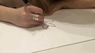
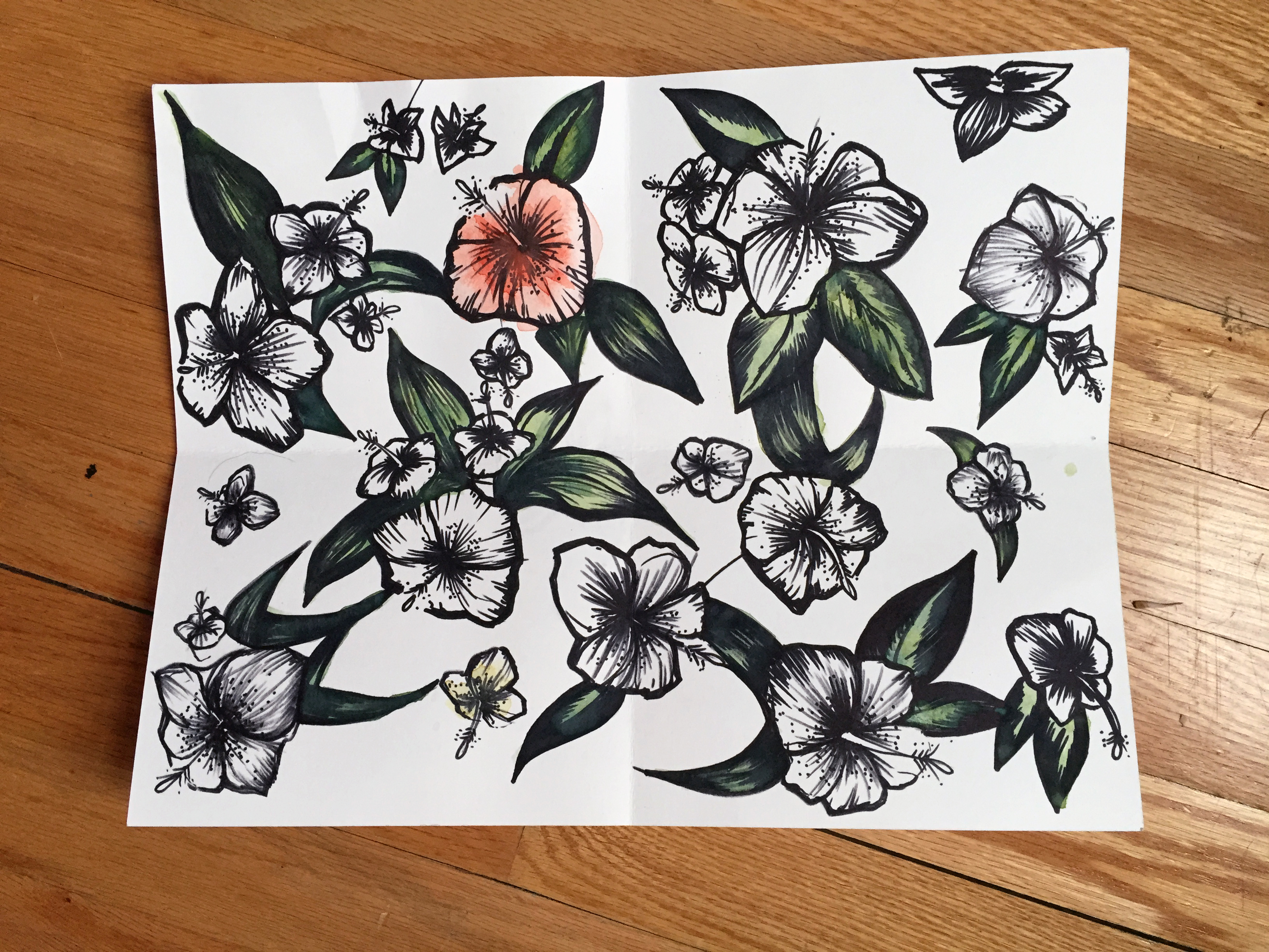
The first thing you gotta do is your floral pattern onto your computer. There are plenty of ways to do this, you can use cameras, scanners, copy machines with scanners at kinkos…but I’m going to show you my way. I take a picture with my smart phone. Some of you may not have a smart phone, and in that case a simple point-and-shoot would suffice. But smart phones are awesome because most of them have cameras with higher outputs than most market point-and-shoots, and that is awesome. Really, the most important thing about the photo is the lighting you take it in. I prefer natural white light daylight. Taking a photo in simple white daylight on a nice day resulted in the following photo…
Not too bad, right? This was actually taken using the Evernote app which has an awesome scanner-like feature to it, in that it crops to the document and even warps it a bit to account for perspective if you can’t take it on an entirely level surface. It even brightens it a bit too, which is pretty helpful when you then take it into photoshop.

This is what the Evernote interface looks like when you’re scanning/taking a picture of a document. It’s pretty cool.
Anyway, pop that sucker into photoshop in whatever way you can.

I have just recently acquired Adobe CC because I am a fancy betch, but these instructions can work in earlier versions. Textile design is an ancient digital art that mostly requires a cursory knowledge of these following tools.

That’s it. That’s pretty much all I used on this particular project. I also am very lucky to have a Wacom tablet at my disposal, but you can do this with a mouse as well.
The following steps will be pretty important in setting up the foundation of your file, in order to always maintain an original copy of your work. I’m a huge advocate of always maintaining working copies as layers underneath your artwork, just in case you need to go back.
STEP 1 Before you do anything, make sure you double click on the background layer in your layers palette, and change it from Background to Layer 1. This just makes it editable, and it is the first step in what one of my old design professors called “the bread crumb trail”.
STEP 2 Duplicate that layer. Now you should have two of the identical layer in your layers palette.

Then rename them.

Or don’t, whatever. I basically just included that step so organized Adobe freaks don’t yell at me about file organization best practices.
But it does help.
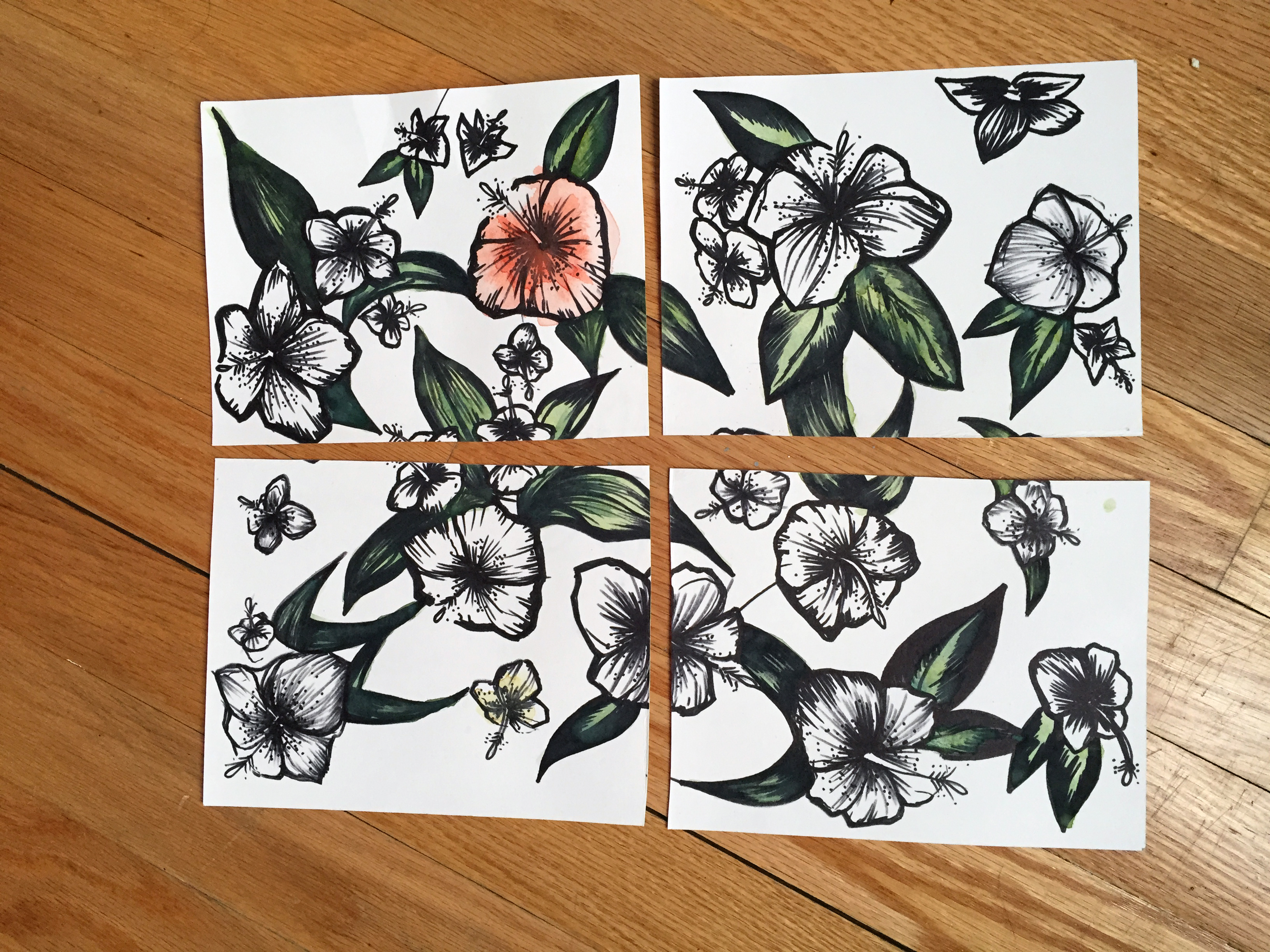
STEP 3 This is the first step in the process of “cleaning the artwork”, as we call it in the ‘biz. To do this you have to see the outer edge of your seam. This is what we created in the last installment of this floral series when we inverted the artwork and taped it together. To do this go to Filter > Other > Offset. It should look like this

This is the offset filter. It moves your artwork over so you can see what it looks like if it were going edge to edge as a never ending artwork.
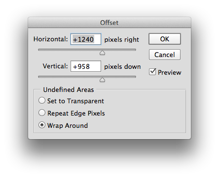
If you play around with the arrows you can see the artwork moving right to left and up and down. This is SUPER helpful as it allows us to edit our floral into a seamless tile.
You can set your artwork any way with the offset filter you prefer. I usually end up setting it so the seams hit somewhere in the center so I can see all four corners. It will look something like this…

You can see in the middle where the artwork is slightly disjointed. That’s where we cut and inverted! My cutting and taping skills are never A+, but luckily my photo editing skills are top notch and I can fix this digitally. If you’re an A+ cutter and taper, with surgeon hands, than you may not need to edit as much as I do.
STEP 4 If you’ve ever used photoshop before then you are probably familiar with the clone stamp tool.  The clone stamp tool basically takes a selected area of your artwork from one place and fills it into another, in order to blend stuff together. We are all familiar with the clone stamp, even if we aren’t photoshop gurus as it is probably at least partially responsible for this amazing and historical art piece.

The clone stamp is a beautiful tool, but also probably responsible for nurturing body issues in humans all across the globe. We can’t have the yin without the yang people.
Luckily for this project we are harnessing the power of the clone tool for good.
This is when the zen part happens and you get to mindlessly clone out the seam for a little while.
So I zoom in real close and start to stamp.

I find it works well if you take from an area that is relatively close to what you are stamping out, as the lighting will be somewhat similar. Even if it isn’t, that’s something we can correct later in the process. You can definitely see in the image above that there’s a difference in the whites from one side of that line to the other.
STEP 5 Add a layer of white in between your safety copy and the draft you’re working on now.

The next step is all about cutting, pasting, and distorting. So this white layer will eventually become part of your overall pattern as the background.
After I cloned out the seam, the pattern was still pretty wonky in places, especially where the leaves ended up not matching up. But no fear! With some photoshop trickery we can fix this. Grab your handy pen tool and start to outline your worst looking floral motif around the edge. I used the pen tool for this one so I could get an exact edge against the seam. After you’re done, make sure to turn that path into a selection by right clicking.

Copy and paste that guy on top of itself so it becomes a new layer. This way you can move it around freely. You can nudge that guy over a bit so he starts to overlap where the wood flooring is in the photo. You can even ⌘T to transform it and distort it so it fits with it’s other half on the other side.
Eventually you’ll start to get something that looks like this

See those crazy spaces where the whites don’t match?

That brings us to…
STEP 6 Blowing out those whites. This step is pretty easy. Go to Layer > New Adjustment Layer > Levels. This is great. This is called non-destructive editing. What this levels layer will do is basically put a layer on top of your artwork that is purely for color editing. It won’t actually mess with the color inside the artwork, hence the non-destructive part of this.
The dialogue box will look something like this.

This basically controls the amount of black, grey, and white in your photo. The white lever on the far right is the one we’re concerned with. The further you bring that to the left, the whiter your whites get blown out. Bringing that just a little bit over makes a huge difference and gets rid of a lot of the dirty white we created while we were editing.
When all is said and done you should end up with something that looks something like this…

And isn’t that beautiful.
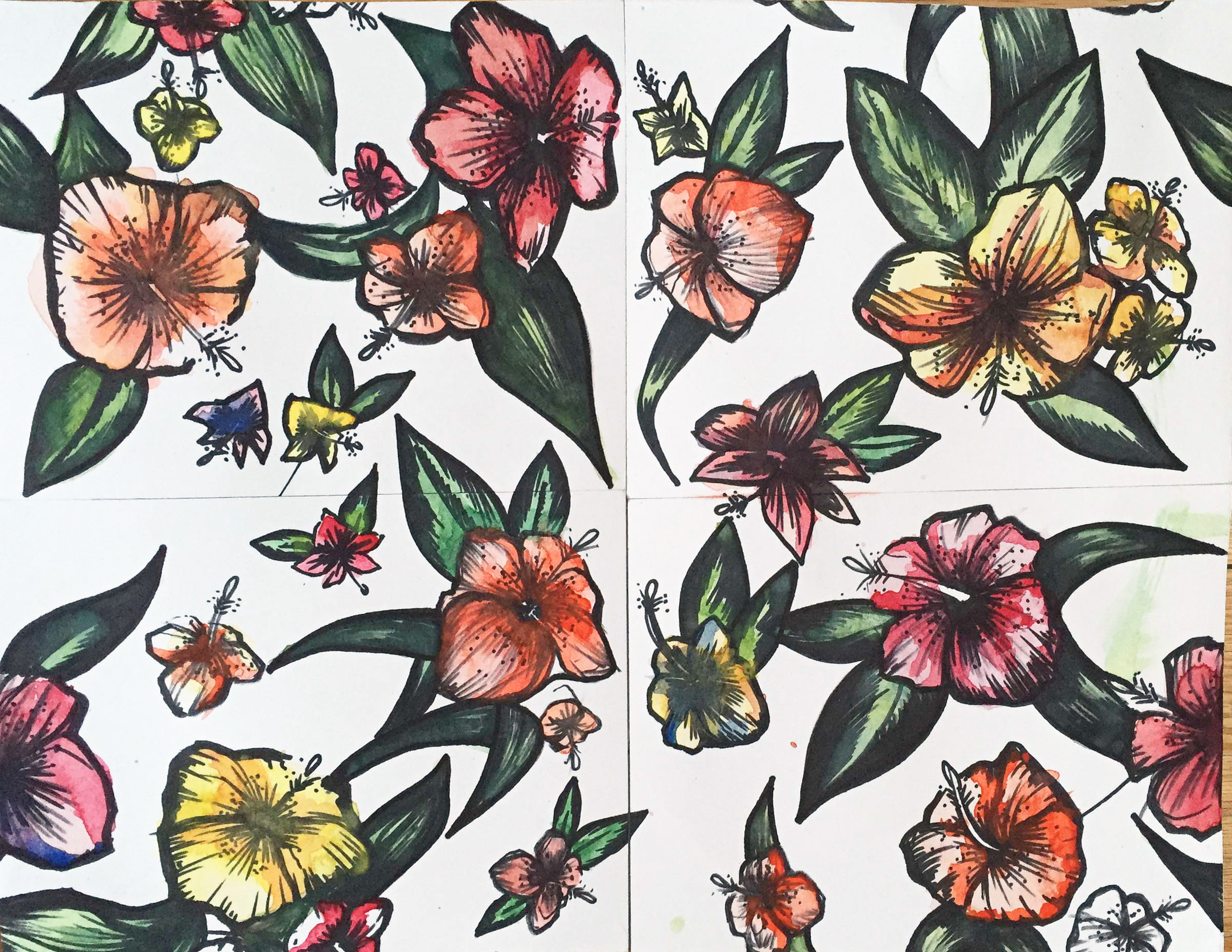
The LAST STEP I usually take is saving this as a PSD file and bringing it into illustrator. That way you can just drag it into your swatch palette for it to become this beautiful thing right here…

YEAH! I know this may have been a little complicated for my first tutorial on fabric design, but next I’m planning on a simple geo, but if you guys have any questions just let me know in the comments!